Homepage › Forums › Photo Critique › Landscape › My first ever image post!
- This topic is empty.
My first ever image post!
-
PeteMcD
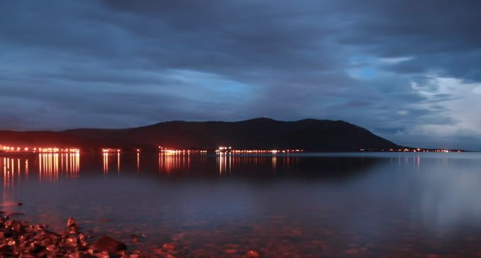
MemberTaken on the ‘beach’ at Warrenpoint over looking Rostrevor across Carlingford Lough.
Comments welcome. Go easy, I’m just a noob :D
Egg
ParticipantMy Eyes!! Its hideous!!!
Only messing Pete, :D
I like it alot. Nice peaceful, dreamlike quality to it. Love the tones too.Flipflip
ParticipantThats a great first post!
I love the shot. The only thing I think I’d prefer would be if you were closer to the town. But thats being fairly picky.
Maybe if there was a small bit of colour in the sky too but you cant really control that.
Still though, good shot!
jb7
ParticipantI like it-
I might consider chopping out most of the foreshore-
maybe only leaving the one rock on the left-j
joolsveer
ParticipantTara
Memberlove picture Pete. Excellent colours and tones. I love the reflection of the sky in the water.
nice one!
Tara
shutterbug
ParticipantNice inaugural (is that how you spell it?) post and welcome to the site, Love the lights and reflections
Shutterbug
carl
ParticipantVery nice shot.
Can I suggest a square crop in the centre and placing the horizon on a third as an alternative. Its very nice as it is, Im just curious to see it square.PeteMcD
MemberThanks for the feedback guys. Quite flattered actually. You’re very kind!
Biggest thing I was trying for here was to use a long exposure to smooth the water. I’m really happy with how that element of
the image turned out. With some dreamy misty reflections of the sky and headland. I also made a point of including some foreground, because that was an element in my composition that I’d never considered.Aye Carl, I’m curious to see what you mean. There are quite a few options if you go square. And to go square and leave the horizon on a third you end up with a very tight crop. Care to show us how you’d do it?
Not sure which rock you mean jb7? There are loads of them!! And to crop to leave just one, you are left with a tiny rock stuck in the corner looking like a misfit. Although maybe I’m misunderstanding what you mean…
Feel free to have a play and show what you come up with. Really interesting to see how you see!
carl
ParticipantHere is a 1/3 square crop (well near enough). Not sure if it works, tell me what you think.
MTBIreland
ParticipantI like the square version… the lights are less distracting and a bit more natural (as natural as street lights can be) in this version and your attention is drawn more to the sky and sea than the lights.
Flipflip
Participantjoolsveer
ParticipantPeteMcD
MemberI’m not so sure about the square crop. It loses the foreground interest and loses the orange tones. I think if I’d framed the initial shot to be cropped square then it could work really nicely, and the horizon on a third would have been nice too. The third def adds emphasis to the sky. Be interesting to try if I shoot there again. Cheers for that.
You must be logged in to reply to this topic.


