Homepage › Forums › Photo Critique › People › New-ish to studio lighting.. and
- This topic is empty.
New-ish to studio lighting.. and
-
nkeegan
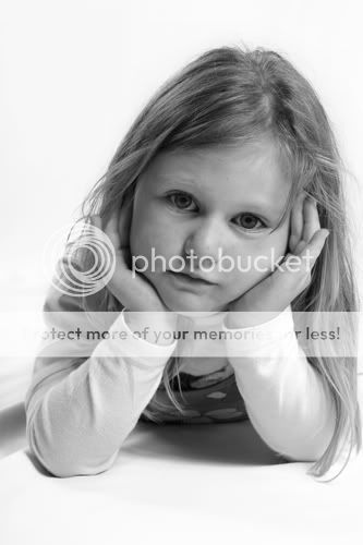
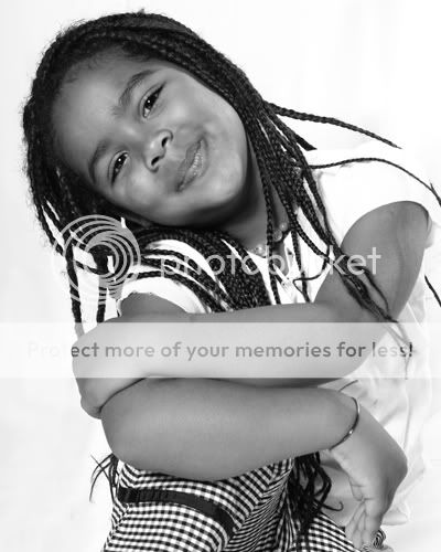
Participanttrying to get to grips with bw conversions (I have Elements 2.0, but I have the ‘curves’ and ‘channel mixer’ plugins). Two recent atempts..
ciaran
ParticipantNicola,
I’d have pretty much the same tips as I’ve passed on in Phototakers, so forgive me if I’m repeating myself.
First of all, the second shot is infinitely better than the first. Contrast is good, it’s sharp, the young girl looks nice and relaxed. Lighting is great and catch lights in the eyes. A really nice portrait. Perhaps a little hot in exposure, particularly as she’s wearing a white t-shirt against a white background.
The first shot is poor. It lacks contrast… one thing to always check is the whites of peoples eyes – they should be white, in this case they’re grey. It’s more a black and grey image. There are no catch lights in her eyes and her whole face is in shadow. She also looks a little tense and as such the pose seems more unnatural.
nkeegan
ParticipantI knew you would comment on these!! I have applied your suggestions about getting more contrast in the second image (its more recent than the first!), so good to know I am improving :D
I will keep plugging on..
Every few weeks, I have been setting up at a childrens play centre for a few hours. I am charging next to nothing for an 8×10 print, but it is getting me the practice and it’s free advertising! I have already got work out of it. Anyway, I am there again on Friday next week, so will try and do better again!
Thanks for the constructive suggestions as usual!gooner
ParticipantHey Nicola,
Really like the second photograph. The kids is really relaxed, enjoying herself which
says something about your technique. Her top is a bit blown out alright, but
still a nice photograph, which her Mum should be proud off
You must be logged in to reply to this topic.


