Homepage › Forums › Photo Critique › Catch All › Of Times Past ….
- This topic is empty.
Of Times Past ….
-
MDCPhotography
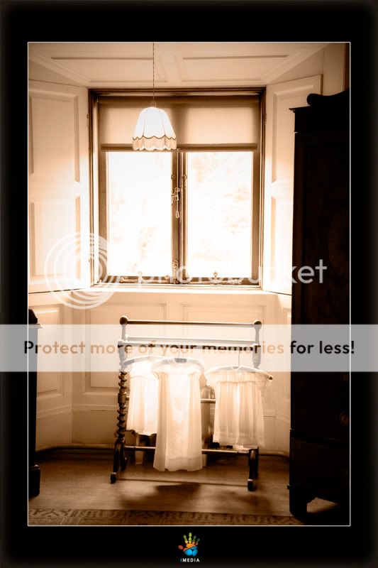
ParticipantNot sure if this is in the right section, this was taken at Westport House a few weeks back, I think it is a very peaceful sort of image in a way, just something about it, some onone processing. I have the original which is in colour.
Please C&C most welcome.
MDCPhotography
Participant26 views and not one reply….. did I do something to PI ?
I depend on PI for c&C to learn but I dont seem to get alot of response to any images I post…..
Can someone advise
jessthespringer
ParticipantIt’s very nicely exposed, wee bit hot on the side panels maybe, but that doesn’t bother me too much.
I’m not so sure about the composition, the dark wood furniture is kinda framing the bottom half of the picture,
maybe a wider view might be more pleasing?Or closer? Those little dresses are very intriguing.
It’s probably just a personal thing, but I don’t like the black border, feels very claustrophobic, or something.
I wouldn’t worry so much about the 26 views and no comments thing, I’ve posted pictures in the past that have had over 100 view and no comments.
Sinead
miki g
ParticipantHi Marty. I am guilty for two of those views (plus this one). If I am unsure about an image, I like to leave it and return later to see how I feel about it. I don’t know how much room you had to work with, or how big the actual room was, I feel the shot is very tight in its composition. I think the wardrobe sort of unbalances the shot also as it is so dark and large. I like the windowlight and the rack with the clothes, but I think a closer shot (maybe in portrait format) might have worked better. As for not getting any replies, Plenty of us in that boat, so don’t worry. :wink:
5faythe
ParticipantHi Marty,
I’ve looked at this a number of times as well.
Like miki g I sometimes come back to an image a few times if I find
I have nothing to say first time round.Like Sinead I’ve had images posted and no comments.
I really like the lighter part of this picture.
The shutters, the window, the hangars, the dresses and the floor.
I also like the tone.The darker pieces of furniture either side take away from the image in my opinion.
It might have been difficult exclude these without moving them.
And moving them might not have been an option.A wider angled lens maybe but might not have worked either.
Of course you might have meant it to be just as it is and that’s just fine too.
I now prefer if images don’t have frames when posted here.
It’s just personal.
Space is precious and we have little of it to show off our images on screen.
I’d rather just have the image to view and comment on.Anyway keep posting and we’ll get ’round to commenting or not
in our own good time. :)Cheers.
John.
MDCPhotography
ParticipantThanks folks, I just started to think my shots were that crapp that people didn’t want to reply lol.
Thanks again
AedanC
ParticipantDefinitely not a crap shot! Don’t even think of it.
I feel everything is leaning to the right, have you tried rotating it anti-clockwise a small bit?
In your original file is there any more detail in the window area? If so it might help to darken that area a small bit, in my opinion it’s a bit overpowering at the moment.
Cheers,
Aedan
b318isp
ParticipantDeebo
ParticipantI agree with John, the dark panel on the right of the frame, take away from the shot.
However, it does have a peaceful feel to it, and I do like the white garments, nicely lit and exposed
Dee
You must be logged in to reply to this topic.


