Homepage › Forums › Photo Critique › Catch All › Opel Manta
- This topic is empty.
Opel Manta
-
paddymcgrath
Participantnfl-fan
ParticipantPaddy…
Would I be forgiven for saying that these are way below your usual standard? I hope so.
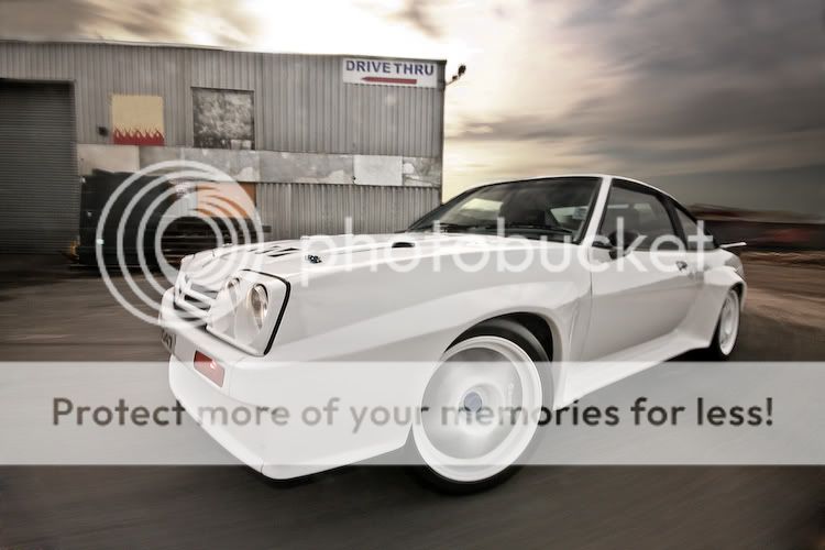
#1 – Background is blurred, but not enought to be effective… found myself looking at the “Supreme Fuels” sign and thinking “I don’t want to read this”. The vignette in the top right corner is a spoiling distraction and the clouds looks blown and also distract.
#2 – Super bright car, dark setting.. doesn’t work for me… looks like the car was cut and paste from another image
#3 – The best of the lot… but nothing to get overly excited about either. Nice without any excitement.
Sorry… terrible write up… sounds like I want to axe you… but I’d be an admirer of your work… and I suppose t’is best to tell the truth.
J
paddymcgrath
ParticipantAnd I’d be upset if you didn’t offer honest advice :)
I’ve actually spent the last hour or so, adjusting that first shot, I brought in the original sky from the RAW exposure, and darkened the glass a bit aswell. I removed the text of the Supreme Fuels sign but not the sign itself. TBH, I don’t feel comfortable adding more blur there when it isn’t in the original. I had a hard time getting some slow exposures (This was 1/2 a second with two Circ polarizers and at F22, ISO100)
Let me know what you think ?
As for the second one, I’ve already addressed that darkness in a more recent edit but just don’t have it to hand, I definitely agree with you on that one though !
MDCPhotography
ParticipantNice shots of an awesome car Paddy. my only hitch would be on the second one it looks like the front of the car has been blurred.
Great shots
jb7
ParticipantGood car alright-
The second here would be a pick for me,
but it’s been framed too carelessly, and wide-I think that losing your light stand on the left,
and cropping down the side of the building to the right might have made it a much better shot-The lighting ratios seem a bit extreme, for me-
and the cross lighting in the third doesn’t seem to model the car to its best potential-
the shadows of the car on the building are a distraction too,
but a minor one, and only because I noticed them-The first, I should like better-
a distraction is the shadow of the boom, I suppose,
and the rubbish under the building-
The sky to the right might have been another backdrop to consider-Perhaps it’s the colour of the car, something beyond your control,
that is the most jarring thing-
although it’s beautifully presented,
it does seem very stark, and maybe difficult to model-But as I said, good car-
I’m sure the owner is very pleased with these-j
scotty38886
Member
You must be logged in to reply to this topic.


