Homepage › Forums › Photo Critique › Nature and Wildlife › Shadows and silhouettes
- This topic is empty.
Shadows and silhouettes
-
Noely F
ParticipantRob
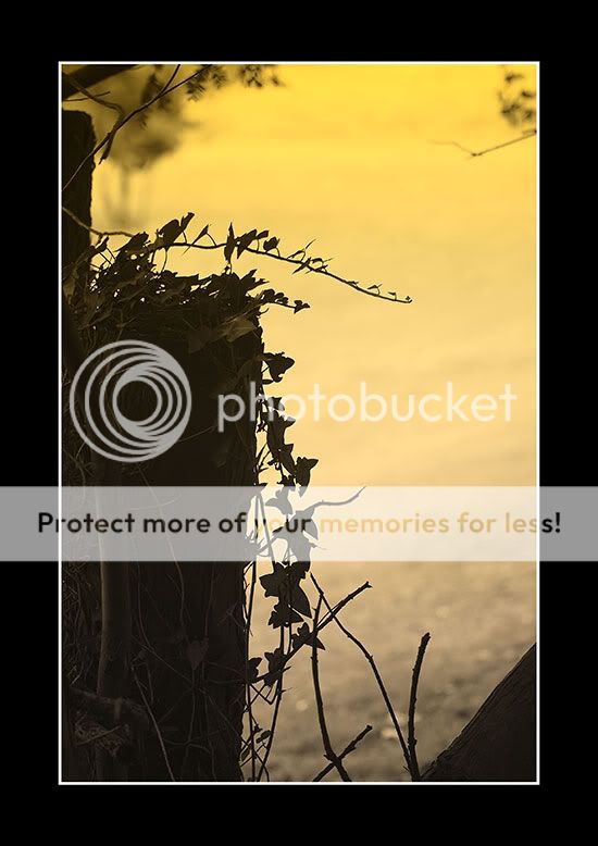
MemberFirst off, let me say I like this image. Great colour and depth, and not so dark as a true silhouette which would kill all the pleasing detail you’ve managed to capture. I also like the way the image appears (on my monitor anyway) to graduate from monochrome to a heavily saturated sepia from bottom to top of frame. Excellent composition and lighting in my humble opinion.
That said, some viewers might be thrown by the diagonal branch in the bottom and the blurred twig and leaves at the top on the right hand side of this picture. They may even advise you to clone them out. Personally, I wouldn’t. I quite like the way the the diagonal branch is mirrored in the top left corner and the blurred twig prevents the image becoming too symmetrical and enhances the overall depth. Nice work Noely. I wouldn’t change a thing. 8)
carl
ParticipantNice image Noely. Cant make up my mind whether I would prefer it darker or not to make it a true silhouette.
So this is what you do in your spare time when you are not “Macro Man”! :lol:jlang
ParticipantI really like it. I love the colour and the fact that it’s not a silhouette. I get the feeling that there’s a horizon out there but I’ve no idea where it is.
Noely F
ParticipantThanks all. it was an underexposed tree stump with the background blown out, just applied a graduated filter in PS and brought out some detail in the stump.This is the result of waiting an hour for a shot of a dragonfly that never showed up…..typical :lol:
You must be logged in to reply to this topic.


