Homepage › Forums › Photo Critique › Catch All › Travel › Spot the Tourist – Egypt
- This topic is empty.
Spot the Tourist – Egypt
-
bingbongbiddley
ParticipantHowdy,
Just my little attempt to show some of the many different tourists spotted around Eygpt.
Feedback appreciated.
Alan
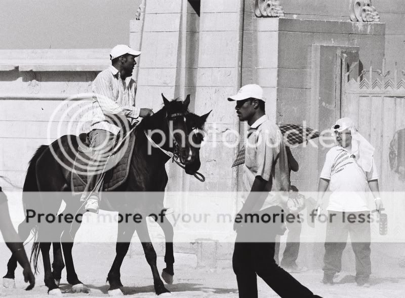
Fitting In – Giza
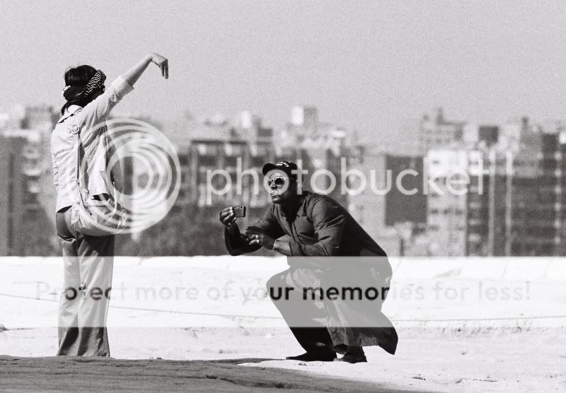
Baksheesh? – Giza
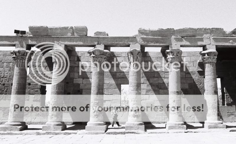
Fanning – Philae Temple
Say Cheese – Luxor Temple
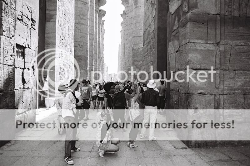
clickclickclickclickclickclick – Karnak Temple
Cookster
Participant#2 is a great shot. Really shows how much effort goes into composition!!!
#3 I like for the simplicity and scale the pillars are dwarfing the tourist. The pillars converging puts me off a bit, moreso cos they are what apeal to me
I see you got Karnak on a quiet day you lucky thing. I walked in as 10 or 20 bus loads descended on the place, it was mayhem.
b318isp
Participantbingbongbiddley
ParticipantThank you both for the replies, lads.
Glad you both like number two – that and clickclickclickclick as I’ve called it are probably my favourites.
b318isp, thanks for complimenting my conversion but it was actually taken with a film camera so I owe credit to Neopan 1600 Professional. :)
Cookster – yeah, they love their massive tour buses over there. Plenty of tourists around at every sight we went to.
The converging pillars are a little annoying, wish I had composed it better. I must keep that in mind in future.Thanks again guys,
Alan
redfox
MemberThe guy in No 1 just needs a pair of white socks and sandles and he’d be a real tourist.
bingbongbiddley
Participantjb7
Participant2 again, as well, I think a bit off the right would transform it, though, maybe-
bingbongbiddley
ParticipantThanks for looking JB.
Not sure how much difference this makes….a square crop would make it too tight but this is almost a square.
Thanks again for the comment.
streetshooter
MemberI think all of these are excellent – you’ve managed to combine Street with Architecture in most cases – definitely nos. 2 and 5 are the best of a good lot!
bingbongbiddley
Participant
You must be logged in to reply to this topic.


