Homepage › Forums › Photo Critique › Catch All › Fashion › Studio shoot…
- This topic is empty.
Studio shoot…
-
JohnnyMcMillan
ParticipantDon’t know if I’ve put these up yet or not…someone saw them the other day and wondered where they came from…so I thought I might as well put them up…
Was a Vermeer inspired (kinda) shoot…
LoGill
ParticipantI’ve seen these before .. probably on your website .
I love these – they are simply beautiful. The glow from the lighting is just … sigh!
As is my bad habit – number 2 jumps at me. Its beyond me to offer any critique.. sorry for the drool :)
L
joolsveer
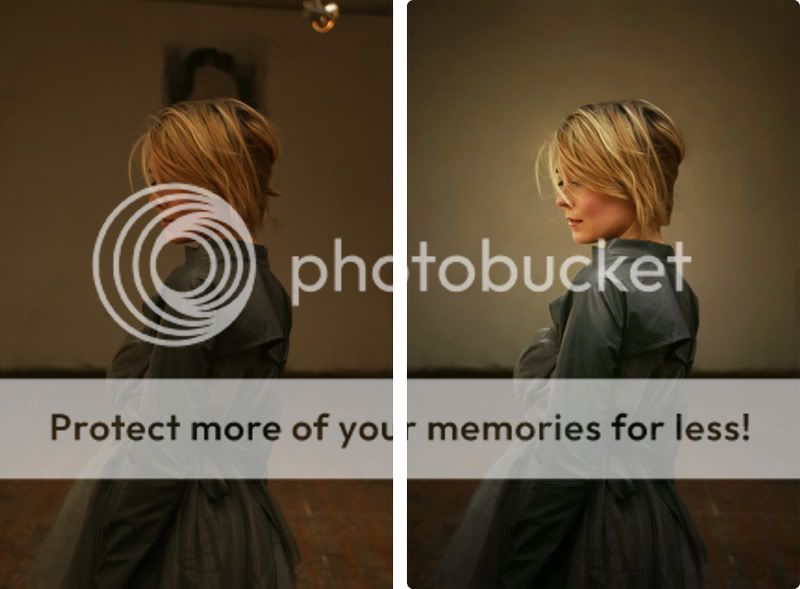
ParticipantThe only issue that I have with these is the background – the hard line between wall and floor. Could you muddy this up a bit by blurring to make it less eye catching. The depiction of the model and her clothes is excellent as is the lighting of the subject.
JohnnyMcMillan
ParticipantCheers Dave and LoGill….
The background wall was heavily worked on…with a little blur added to that joining part…here’s a before and after shot…
jb7
ParticipantI wouldn’t have a problem with the wall/floor junction at all,
I think its perfectly placed and described.
These are lovely shots with a really good model and strong design underwriting it all-
There’s nothing out of place here-
Though its funny how you can’t please all the people all the time-j
absolon
Participantearthairfire
ParticipantLove them – such a simple elegance to them all.
Out of the 3, 2 jumps out at ma most.
Only slight improvement I would suggest would be to check if the floor is horizontal – not sure if it is on no 1 – but my eyes could be wonky
Tim
Flipflip
ParticipantFloor line is fin to me, I quite like the divide actually.
3 very nice shots. I love the processing!
JohnnyMcMillan
ParticipantPeteTheBloke
MemberThese are nice Johnny. I like no.2 best aswell. No.1 makes your model look a little unbalanced (not in th unhinged sense, she just looks like she’s about to topple).
I’m sure you wished afterwards that you’d taken that hanging off the wall before shooting?
I’m interested to know if there was a particular work of Vermeer’s that you had in mind?
Ali
ParticipantLOVE these shots Johnny, saw these on your site a good while back and they really stand out. Very very nice series and i think definitely think worthy of publication.
Modelling and mood is great, really suits the attire. Big Thumbs up.JohnnyMcMillan
ParticipantWell it was just the style of lighting, and some costume work that I wanted to base it on. In these shots, it was done with natural lighting by ceiling windows in an old studio in Dublin. And yes…I did want to take down that poster in the background, but unfortunately it was wall paper pasted on….! lol
Here’s two Vermeers to which I was on about…
Thanks Ali!!!!!
PeteTheBloke
Member“A lady writing a letter with her maid” and “Milkmaid”.
I was in the Louvre and saw “The lacemaker” in September. It’s very small, but exquisite. You won’t be surprised that “View of Delft” appeals to me as a landscape photographer. He didn’t do many landscapes though.
There is some suggestion (you probably know this) that he ‘cheated’ by using a camera obscura to get his perspective right. Some people say he just used one eye.
EDIT Steve’s comments reminded me to say… your PS work is excellent.
SteveD
ParticipantHey Johnny,
I don’t ever post in the fashion forum, but this time I had too! These are really very impressive, 1 & 2 more so than the third I think. Thanks for sharing your post-processing work here, it is always nice to see a before and after.
Great stuff,
SteveAllinthemind
ParticipantVery nice Jonny (bloody brastraps in the one with her back to us). They have a Vermeer feel alright, I saw these on your site I think and have liked them since then.
Si
You must be logged in to reply to this topic.


