Homepage › Forums › Photo Critique › Landscape › Twenty Seven
- This topic is empty.
Twenty Seven
-
DenverDoll
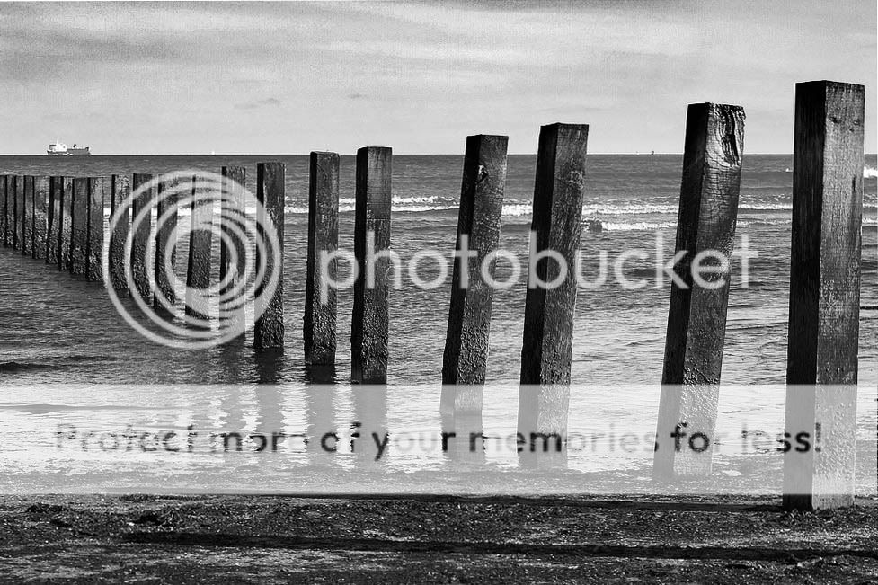
ParticipantI know this lacks drama and maybe a decent focal point..but suggestions anyone has for any and all improvements in all areas for this shot is appreciated. I am really interested in seascapes. Thanks a mil!
:) Shar
RavenAsh
MemberDenverDoll
ParticipantLuc
ParticipantLooks good in BW.
It is funny to see how it changes the impression and the interest.
On the colour one, I looked directly to the boat and on the BW I look to the posts (I hope it is the name for that).
The perspective is interesting. Could you do the same with the boat at the end of the posts?
That would draw the eyes to a point.
I would also suggest to wait for a cloudy sky.RavenAsh
MemberTompixBandon
MemberHi Shar,
I like the composition. May I suggest the following:-
I’d crop away a god bit of the flat sky from the top and also some of the foreground (including the shadow whose post is out of shot). That would give it a more panoramic shape and I think that will help.
I’d also clone out whatever is on the horizon to the right.
It would also help, if possible, to add a bit more contrast to the wood, in order to highlight it.
I’m inclined to stay with the colour version for now! I like the range of blue tones in the shot.Hope that helps!
Tom.Martin
ParticipantNice shot Sharon.
Here is my take on how to post process it (only 25 now:-))
Convert to B+W in the channel mixer
Crop from bottom and left
Burn in the sky
Burn in some of the posts
Up the contrast with an s shape curveHope you like
MartinRoberto
MemberRavenAsh
MemberLike the improvement on this Martin.
Really brought out the grain in the wood.snaphappy
MemberAli
Participantaww :) one for every year of my life.. this is where I ask you for a print :) I like the composition Shar. Did you take a portrait shot of the same scene?
DenverDoll
ParticipantWow thanks everyone for the terrific suggestions and improvements! :D :D :D
Ravenash~~~b/w..a good idea…look how they took your idea and just ran with it..wonderful!
Luc~~~your suggestion to wait for a more dramatic sky would greatly improve the interest..thanks!
Tom~~~thanks so much for your input…all those bits and bobs taken on board :D
Martin~~~absolutely fab edit…thank you so much for improving the sky especially..and as always..describing the steps you used in processing..I love it..I wish it were mine :roll:
Roberto~~~I am delighted you worked your magic as well….both are stunning interpretations and a vast improvement over the originals…again…I wish they were mine :cry:
snaphappy~~~ :lol: I wondered if anyone would have a clue what I was talking about :wink:
and…………ALI…!!!
You are the first person to ever ask me for a print…I am so tickled…it’ll be there with bells on faster than you can change your mind about it :lol: ..no..no portrait..but it will work never the less…and also…now those big pylons just look like big brithday candles to me 8) :lol:
I am thrilled with the responses here..they are much appreciated.
PeteTheBloke
MemberI like Martin’s edit. It’s true what Luc says about the boat too.
Nice work.
beth
Participantgreat work shar. love the comp., can’t wait to see more seascapes from you, bit of a change from your normal landscape variety in colorado.
beth
You must be logged in to reply to this topic.


 :) Shar


