Homepage › Forums › Photo Critique › Landscape › Uncle Tom’s Cabin
- This topic is empty.
Uncle Tom’s Cabin
-
joe_elway
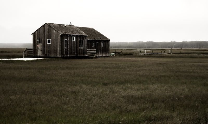
ParticipantI spend a fair deal of yesterday asleep after an early start for a sunrise. The heavens opened up after breakfast so I went into hibernation. I went a wandering around lunch time looking for potential shoots in case it dried up. I passed this place and it made me think of an old song from my misspent youth (http://www.youtube.com/watch?v=te1iSbyaR9I).
seanmcfoto
MemberHi Aidan,
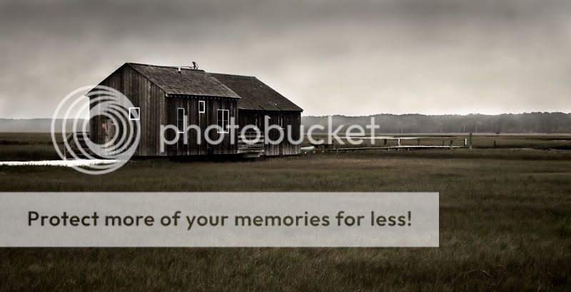
I like the tone on this, but like people suggested with my recent shot of a tree.. go for the panorama and cut out the grass at the bottom. It took a little time to load so I actually saw it as a panorama for a few seconds and it’s really strong that way.beth
Participanti like sean’s suggestion and heres another, since there isn’t much detail in the sky try it in b&w (or since it makes you nostalgic, maybe sepia…).
lovely detail, very beautiful work.
bethRodcunha
ParticipantI like this a lot, great location Aidan!
Probably it will work well on the panorama crop sugested, but it works quite well!PoeticJustice
MemberI wonder if you should include a lot more sky to highlight the empty infinity of space, or a lot less sky because it’s so featureless. It’s not as good as some of your other photos if you don’t mind such a blunt observation, the whole composition lacks interest.
Horace
cian.m.hayes
ParticipantI agree that the Panaorama works really well but I’d bias the crop towards the grass, I tried it with the tree line along the top third line and I really liked it. For me what makes the shot is the muted/earthy colours in the grass and the hut and how the work together, also the expansive flatness is really nice. Love the image but love it more with the panoramic crop.
//Cian
joe_elway
Participantbeth
Participantlove the retouch. great choice. the sky detail really helps too, the tones and color in the sky mimic the house..
bethrandomway
MemberIt only needs a huge black frame to make it more depressing. I like it with the tighter crop, very nice work.
earthairfire
ParticipantAARRRGGGHHHH. NOOOOOOOOOOOOOOOOOOOOOOOOOOOOOOOOOOOOO
Aidan – what are you thinking? Ditch the PS sky! :D
This could make a stunning B&W conversion using a panoramic format, with the original image.
Take a look at the home page of my website, if you want to know what I’m thinking of. Might not float your boat, but i love it, and think that this shot could make a cracking alternate along the same theme…
Tim
Rob
Memberearthairfire wrote:
AARRRGGGHHHH. NOOOOOOOOOOOOOOOOOOOOOOOOOOOOOOOOOOOOO
Aidan – what are you thinking? Ditch the PS sky!
My thoughts too. You’ve lost that sense of desolation by adding an extra element
that wasn’t there to begin with. I’d agree with Tim regarding the panoramic format,
and I’d place the horizon dead centre. Wouldn’t go with the conversion though; I like
the tones in the original…Rob.
joe_elway
ParticipantLOL! This one is kicking up a dust cloud of disagreement!
I couldn’t go mono with this one. I love the muted colours of the reeds and the timber.
EDIT #1: Hmm… just had an idea …. will come back to this one later. Must do some house cleaning first … been avoiding it for a day and a half.
EDIT #2: Desolation … :D I cloned out a bridge that leads to a national park in the background and opposite this is a normal street full of houses … had to take the picture from the car because there was no where to park in the area :D
joe_elway
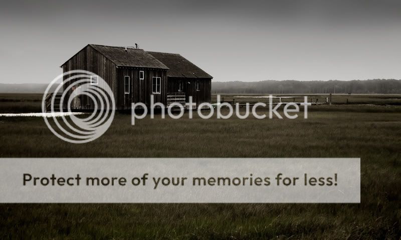
ParticipantThis time, I went with a small vignette on all sides and a “Top Gear” style ND grad on the top. Let’s see who kicks up now :D
Rob
MemberThat’s not so bad Aidan, but I think I’d like to see a cross processed version next… :lol:
Rob.
You must be logged in to reply to this topic.


