Homepage › Forums › Photo Critique › Landscape › Wild Garlic Graveyard colour or b+w
- This topic is empty.
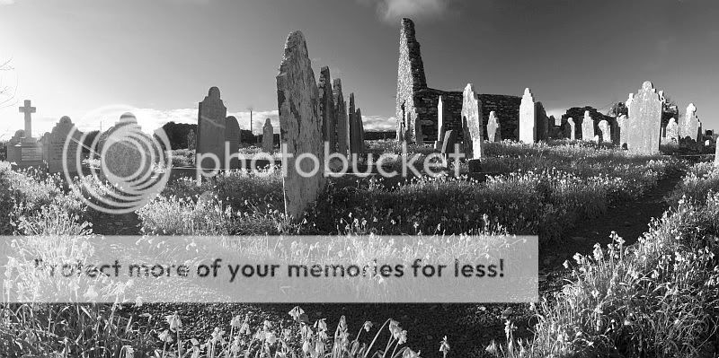
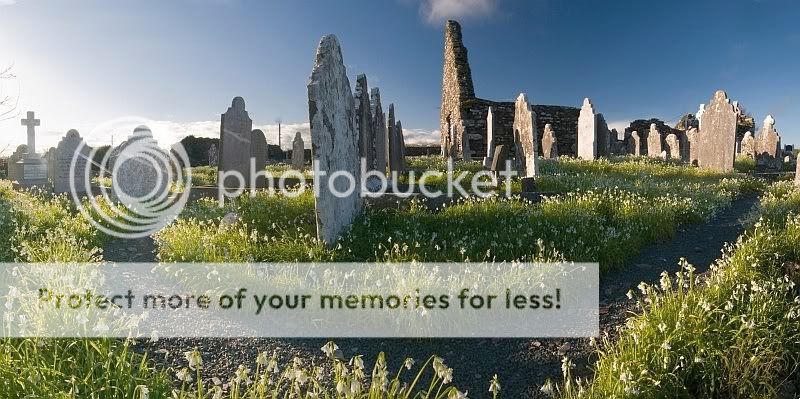
Wild Garlic Graveyard colour or b+w
-
wesleylaw
MemberBricker
ParticipantNicley worked out shot.
I cant decide as they are both good.
A few of small things Ill mention assuming you want C&C.
The half little white puffy cloud directly above the gable of the ruin is annoying me! Have you tried to clone it out?
The intruding twigs (or is it your hair?) on the left ditto. Personally I would try to to crop from the left and take out up to and including the cross headstone. Partly because of the sun and flares – and partly because that headstone is out of character with the rest.
Oh, and the telephone poles….. clone them while your at it.
Good stuff…. and now I am sure…. its colour for me!
Gary McParland
ParticipantReally like the colour version, dont mind the cloud but i agree with the twigs and telephone poles cloning suggestion from Des. I would leave the cross in too if possible.
Rgds
Garywesleylaw
MemberYa. The twigs and poles have to go. I will see what it looks like without the cloud above the ruin too. I would like it more, if it was more of a cloud rather than the bottom of one.
This was a test stitch using small jpegs to see what I could get out of it. Hopefully I can replicate it with bigger files before I do any more to it.
I like the cross on the left. I think it acts as a small point of interest over there. Maybe if there was no nameplate it would be more in character.
I would leave the cross in too if possible.
I assume you mean a crop also Gary. Both of you see the sun as a problem. I know its blown. Even though I consider it a flaw, I like it. If I could blend it more into the blue I would be quite happy.
Thanks.
Mr.H
ParticipantThis is one that really needs ‘smellyvision’!
Both look pretty good to me but I have a slight preference for the b&w- don’t mind the blown bits myself. It has a really light and airy feel which is unusual for a graveyard scene.
Gary
flynny
ParticipantIt’s a flip of a coin for me Wesley,
They are both good in there own way,
apart from the few niggles mentioned above,
the only thing I could add would be a revisit with a better sky,
It might look better with a little more detail(clouds).
Is this the 2mile Inn??5faythe
ParticipantHi Wesley,
The little niggles have been well aired above.
I liked the mono from 1st view. It is an interesting scene.
Didn’t really notice the cross ’til it was mentioned.
Nice.
John.
Gary McParland
ParticipantHi Wesley
I meant keep the cross in as i like it personally, just try and clone out the twigs beside it. It doesnt really need cropped and i dont mind the sun as it has a nice fresh feel to it.
Rgds
Garywesleylaw
Memberflynny: Its Churchtown South (up the hill from the church in Ballycotton 2ish miles)
Mr.H: “smellyvision” There certainly was a fair honk off them.
Thanks John, Gary.
You must be logged in to reply to this topic.


