Homepage › Forums › Photo Critique › Landscape › wild lahinch
- This topic is empty.
wild lahinch
-
trev
MemberMark N
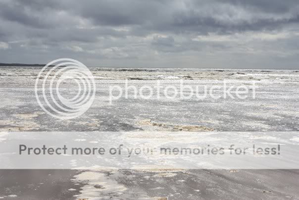
ParticipantNice moody clouds but I think a bit of foreground interest would improve both images.
Mark
wirepic
Participanttrev
Memberwirepic wrote:
CCW rotation is needed on both. Nice clouds and good exposure.
Whats CCW rotation? :D
MartinOC
ParticipantIf you have good high resolution image I guess these would look great printed large, plenty of interesting texture in both, looks well exposed nice.
I agree about the CCW thing.
Btw, to take a slightly modified definition from wikipedia,…
“In a mathematical sense, a circle defined parametrically in a positive Cartesian plane by the equations x = -sin t and y = cos t is traced CCW as t increases in value.” :shock:I hope that clears things up :D
M
5faythe
ParticipantHi Trev,
I think you have a couple of good photographs here.
I find a certain attraction in minimalist composures like this when well executed.
With few elements and a lack of clutter they can make interesting viewing.As has been mentioned the horizon is slanting down from left to right and
unless you have purposely composed the image this way you can correct it
by rotating the image in a counter clockwise direction in your processing
software.
You will lose some of the image when you crop after rotating which can
often change the look of the image.
For this reason it is important to keep a close eye on the horizon at the
time of capture.Well done.
John.
trev
Memberplayed around a bit with this one using photofilter, let me know what u think :D
MartinOC
ParticipantThis one has a much better horizon.
But I’m not sure about the new processing, it seems to have removed a lot of the detail from the shot, and for me the detail was very engaging.
I think I would prefer the original (with rotation), to this processing.Martin
trev
Membertrev
Member
You must be logged in to reply to this topic.


