Homepage › Forums › Photo Critique › Landscape › Youghal Lighthouse at Night, b&w image added.
- This topic is empty.
Youghal Lighthouse at Night, b&w image added.
-
Seaview
Participantshutterbug
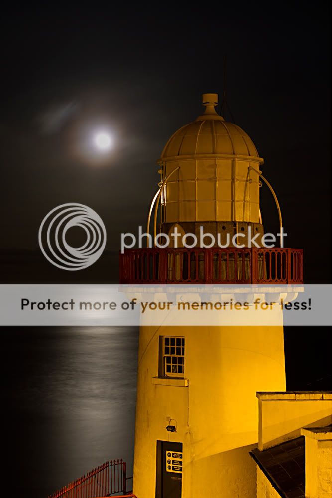
ParticipantThats nice Dave, I particularly like the portrait version, although I love
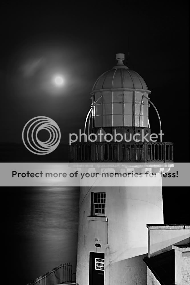
the colour in it, I think this could look good in black and white also.fguihen
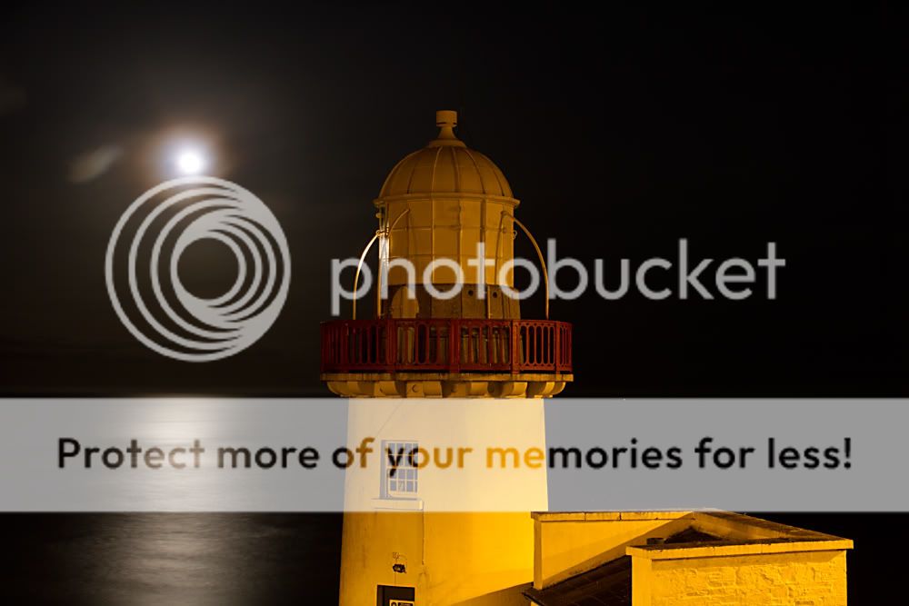
ParticipantNice job. like the soft texture of the water. I dont know the area, but are you cropping out the bottom of the lighthouse for any particular reason. they feel a little too tightly cropped ( mainly the 1st one). Id like to see the base of the lighthouse in the image.
Seaview
ParticipantThanks for the comments, I haven’t done any cropping but you’re right, the images are composed to avoid a steel gate with a large and nasty sign on it. Maybe I could have included a little more which would improve the overall composition of the image.
Dave.
insertnamehere
ParticipantSeaview
ParticipantAs requested, I don’t think it’s the greatest conversion but I’m sure you’ll get the picture.
Dave.
shutterbug
Participantinsertnamehere
ParticipantScenes
MemberEither works for me, but I marginally prefer the colour version.
I hate to nit pick such a lovely image, but I think I would have a go at the health and safety notice on the door.
Seaview
ParticipantYou’re quite right about the H&S sign, I saw that myself in the B&W version but I was to lazy to remove it. I will certainly remove it when I’m getting ready to print it.
Dave.
flynny
ParticipantHi Dave
It’s a difficult LH to shoot
I’ve never really got a shot of it that I was happy with
You’ve done well here
I’d vote for the mono
Have you tried playing around with the WB
The street lighting is giving it a bit of a warm color
Maybe a cooler WB ??
Either way,
Nice work
You must be logged in to reply to this topic.


